wise rebrand
In this project I worked with a group to rebrand WISE Against Violence, a non profit that provides resources to individuals suffering from interpersonal violence.
The Need
WISE is a nonprofit that serves individuals, children, and families in Mecosta, Osceola, and Newaygo counties. The organization provides crisis intervention and support services for those affected by interpersonal violence.
The existing brand identity of WISE did not correctly represent who WISE served and what they provided for the community. Previously branded as Women’s Information Service, Inc., the identity implied that WISE was mainly focused on providing their services to women. In reality, WISE provides services to anyone who may need it, which encompasses a very diverse group of people.
The Users
My team identified 3 main users of WISE. These users are:
Individual Survivor
The individual survivor’s goal is to find refuge away from their aggressor, and to have a solid support system.
The individual survivor’s goal is to find refuge away from their aggressor, and to have a solid support system.
Individual with Children
The goal of an individual with children is to find safety, and to provide the necessities for their children, such as food, clothing, and diapers.
The goal of an individual with children is to find safety, and to provide the necessities for their children, such as food, clothing, and diapers.
Monetary Donor
The monetary donor wants to make a difference in their community and help those in need by providing donations to WISE.
The monetary donor wants to make a difference in their community and help those in need by providing donations to WISE.
Conceptual Development
Through research and rounds of iteration, my team and I identified key messages and themes that represent the WISE mission. We discovered that there were multiple concepts we could use to depict these ideas.
Story
WISE aspires to tell the stories of their people and their journey.
WISE aspires to tell the stories of their people and their journey.
Support
WISE helps people rise above their struggles by providing support.
WISE helps people rise above their struggles by providing support.
Strength
WISE stops violence in its tracks and gives their clients strength.
WISE stops violence in its tracks and gives their clients strength.
The New Brand Elements
After many rounds of iteration, we developed a new brand identity for WISE that represents the concept of strength.
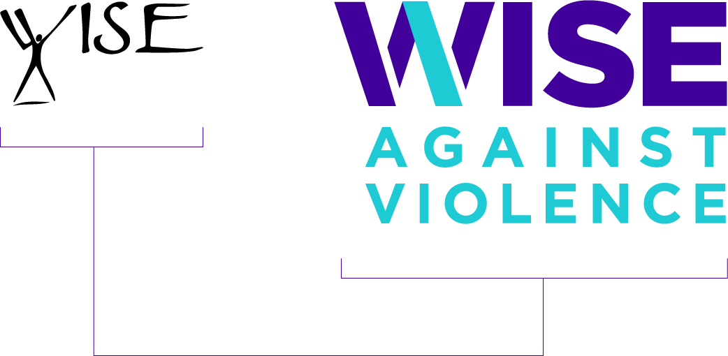
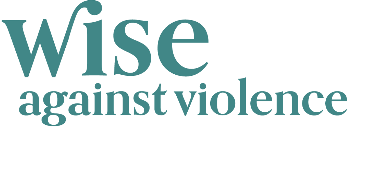
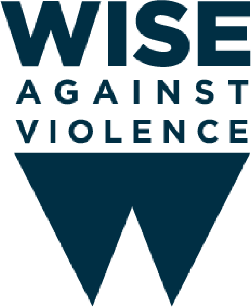
Logo
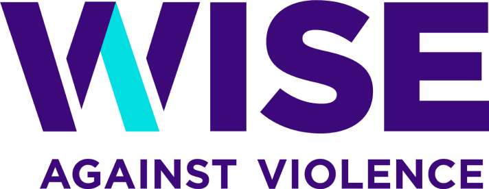
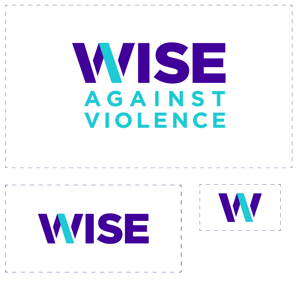
To clearly represent the idea of strength, the logo uses bold, all capitalized type and contrasting colors. It also uses the WISE People Symbol, which highlights the diagonal stroke of the letter W. The WISE People Symbol represents “the individual” in the face of adversity, and can be used in other areas to represent “strength in numbers.”
To clearly represent the idea of strength, the logo uses bold, all capitalized type and contrasting colors. It also uses the WISE People Symbol, which highlights the diagonal stroke of the letter W. The WISE People Symbol represents “the individual” in the face of adversity, and can be used in other areas to represent “strength in numbers.”
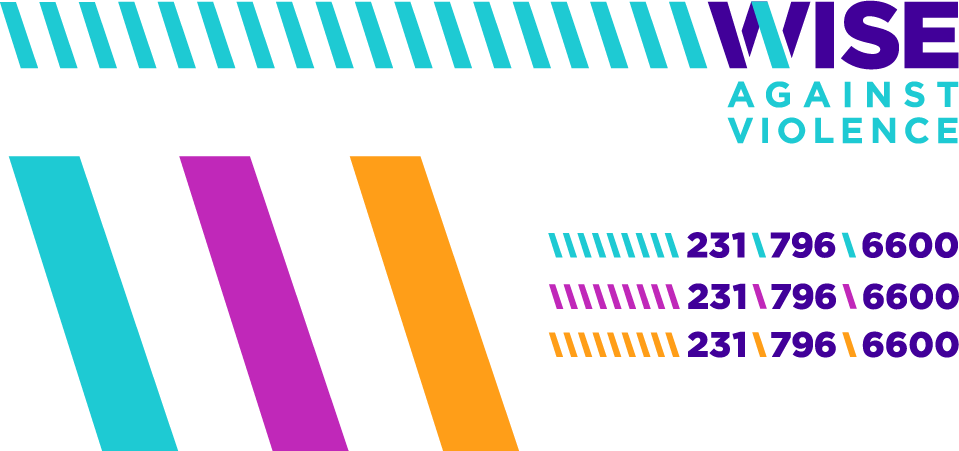
WISE People Symbol
The WISE People symbol is a mark used to highlight the individual fight against interpersonal violence. It can, however, be used in multiples to represent the concept of “strength in numbers,” as the individual comes together.
The WISE People symbol is a mark used to highlight the individual fight against interpersonal violence. It can, however, be used in multiples to represent the concept of “strength in numbers,” as the individual comes together.
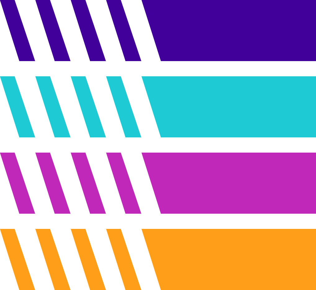
WISE Colors
The WISE color palette is meant to be bold and bright to further establish the concept of strength.
The WISE color palette is meant to be bold and bright to further establish the concept of strength.
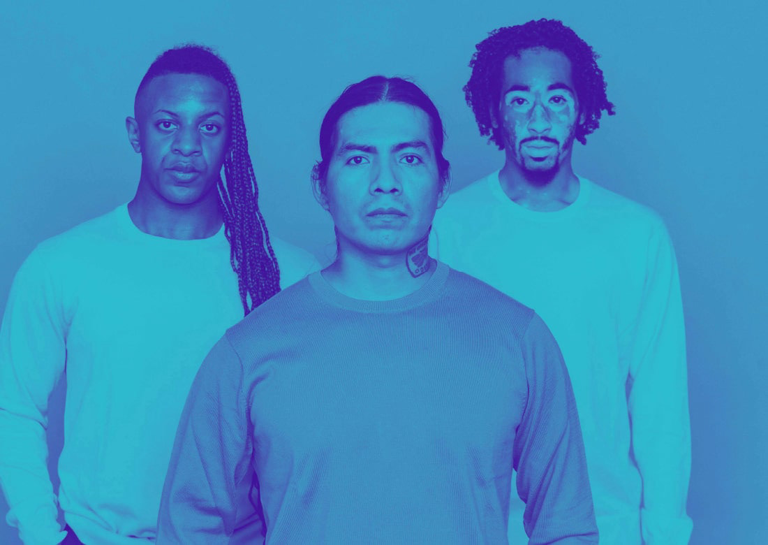
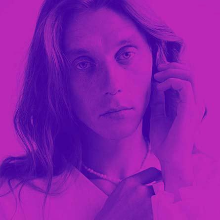
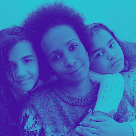
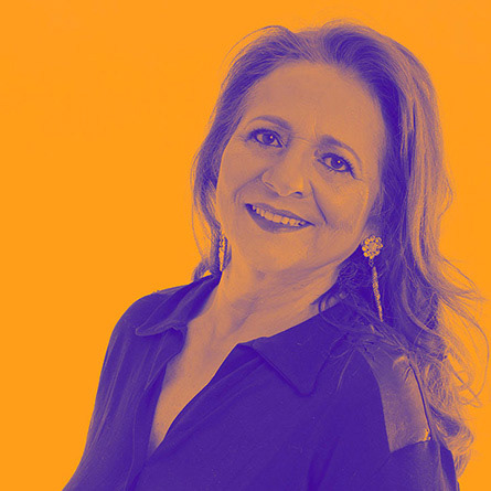
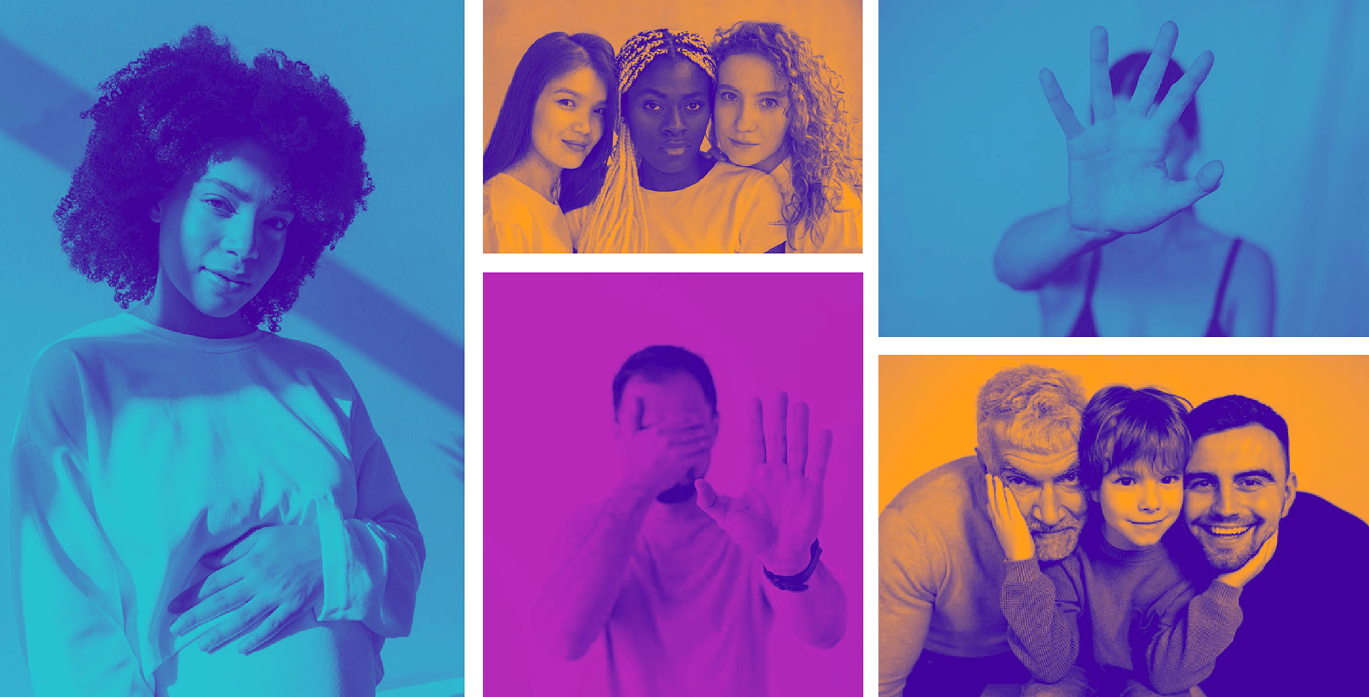
Imagery
With the imagery, we really wanted to highlight the diverse group of people that benefit from WISE services. To make the imagery bold and strong, we curate images with people staring directly at the camera. The image treatments we used include color overlays, with the intention to create eye-catching pieces, especially when paired with another vibrant WISE color.
With the imagery, we really wanted to highlight the diverse group of people that benefit from WISE services. To make the imagery bold and strong, we curate images with people staring directly at the camera. The image treatments we used include color overlays, with the intention to create eye-catching pieces, especially when paired with another vibrant WISE color.
How did we set WISE up for success?
We created many different assets for WISE to use, and resources to maintain consistency across their new branding.
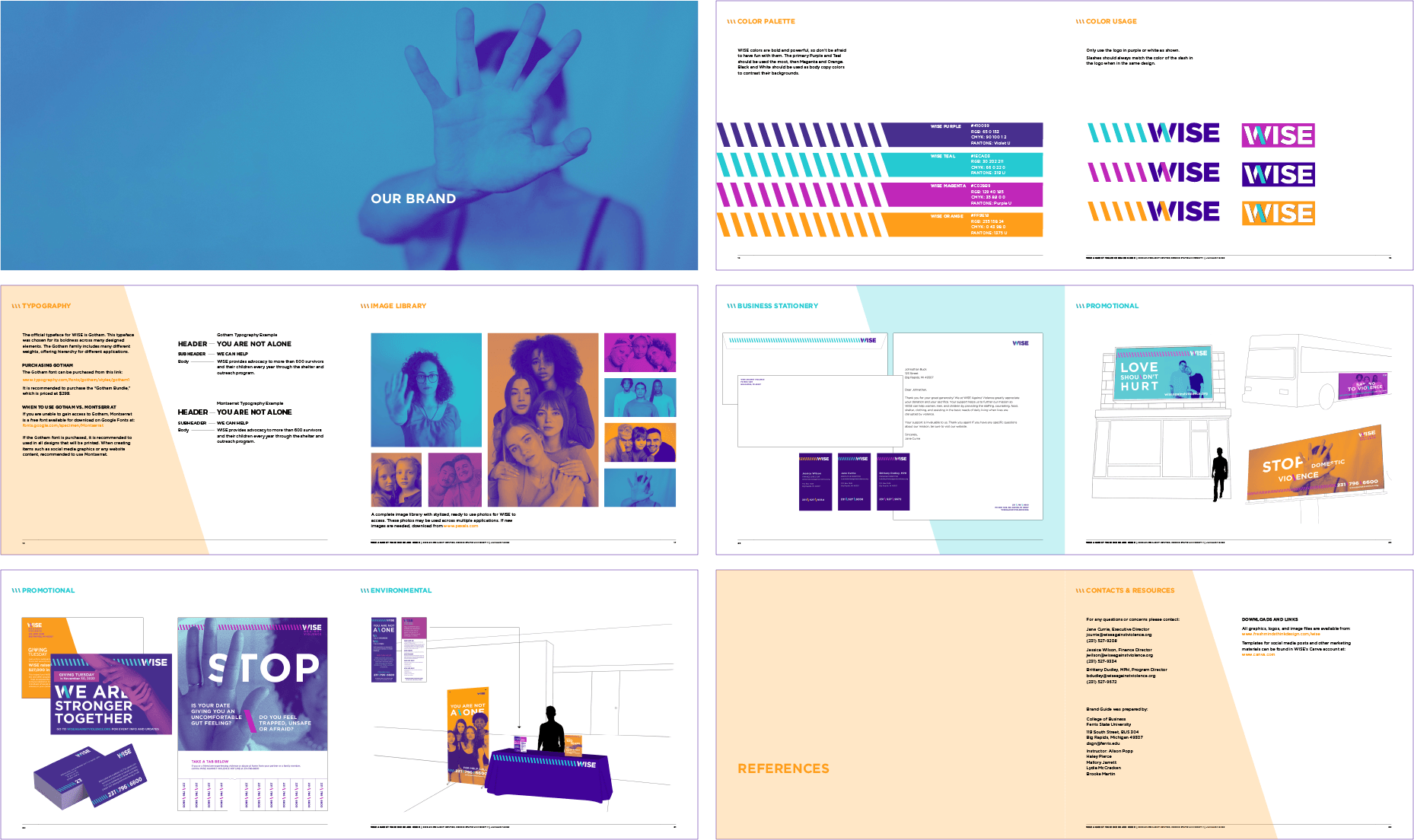
Brand Guide
To establish consistency across all applications, we created a Brand Guide that sets rules and examples for using the WISE branding.
To establish consistency across all applications, we created a Brand Guide that sets rules and examples for using the WISE branding.
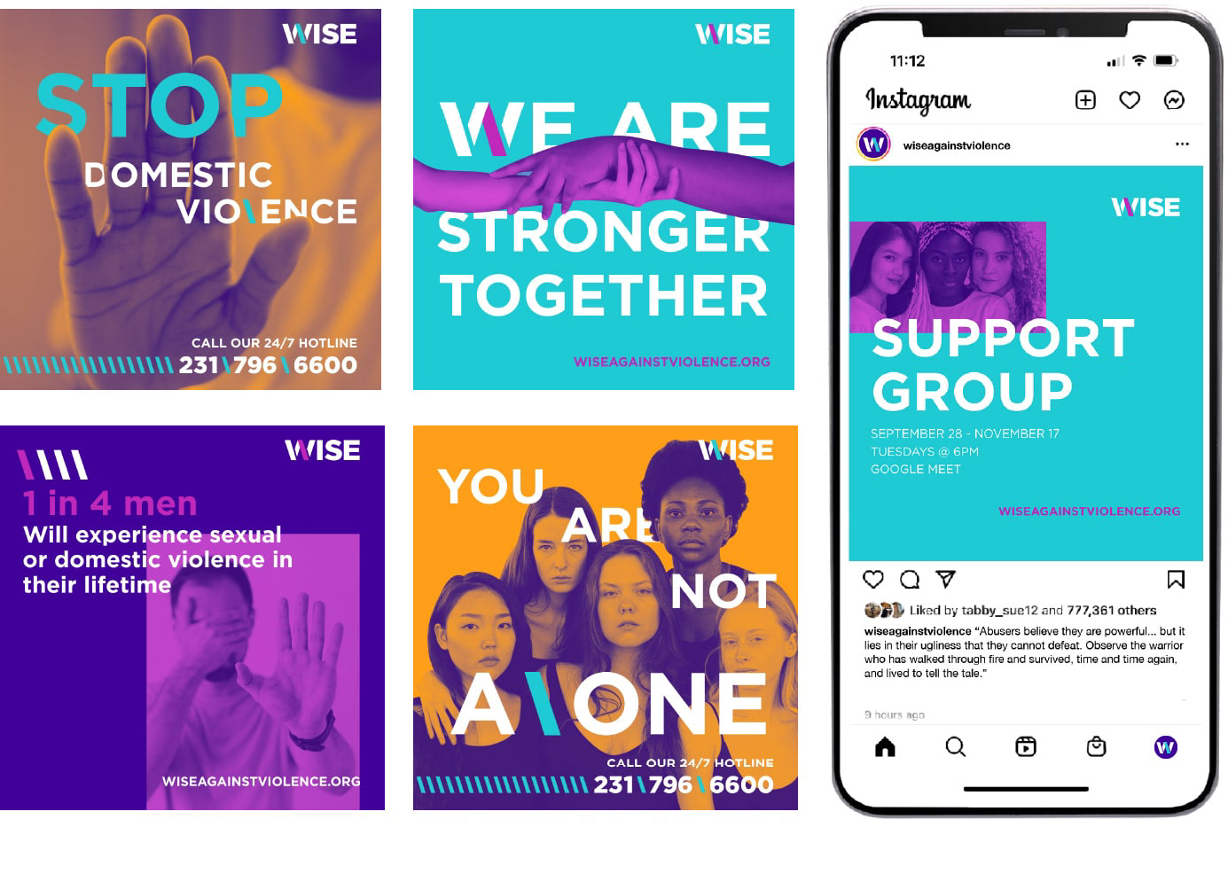
Social Media Templates
The WISE crew are extremely busy people! To make their social media presence easy to manage while still establishing consistency of the brand, we created pre-built Canva templates.
The WISE crew are extremely busy people! To make their social media presence easy to manage while still establishing consistency of the brand, we created pre-built Canva templates.
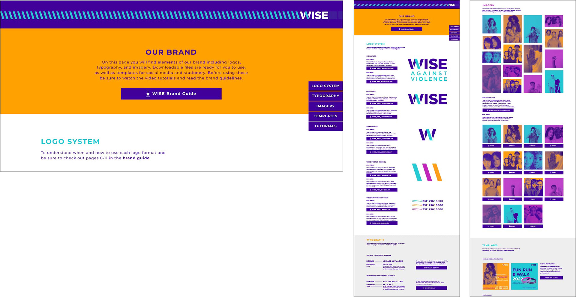
Brand Kit Website
I designed and developed a brand kit website, which includes all of the assets that the WISE team needs to preserve their brand, in the form of downloadable content. It also includes video tutorials that walk through using templates and assets.
I designed and developed a brand kit website, which includes all of the assets that the WISE team needs to preserve their brand, in the form of downloadable content. It also includes video tutorials that walk through using templates and assets.