recognize & respond campaign
Recognize & Respond is a campaign intended to teach the community at Ferris State University to recognize potentially harmful situations and comments related to dating and domestic violence, sexual assault or stalking, and how to respond to those situations in a safe and effective manner.
Project Overview
I worked with a team of three other designers to design a visual identity and messaging system for this campaign. The client, the Anti-Violence Alliance at Ferris State University, teaches bystander intervention tactics through presentations and events on campus. When branding the campaign that surrounded this curriculum we needed to keep many things in mind including: cultural sensitivities, representation, reach, and more.
Key Messaging
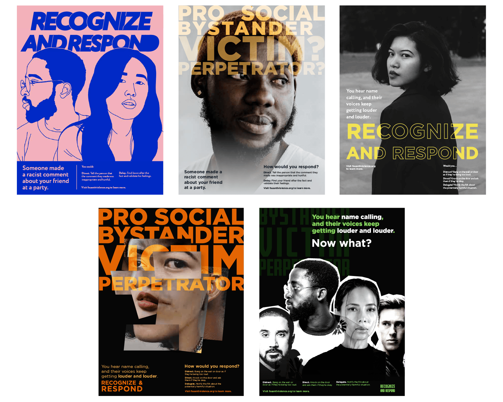
We started by crafting a main message that we could use as an introduction to the main tactics that are taught in the bystander intervention curriculum. We narrowed down 3 key messages. From there, we presented iterations of different visual identities tied to each message to our client.
Key Message 1:
Recognize & Respond
Recognize & Respond
Individuals must learn to recognize the signs of inappropriate conduct and be empowered to respond in a way that enacts change and prevents similar future situations.
Key Message 2:
Shoulder to Shoulder
Shoulder to Shoulder
Individuals must link together to combat inappropriate behavior that could lead to further, much more harmful actions.
Key Message 3:
Find the Courage
Find the Courage
In a world where many people easily ignore inappropriate behavior, individuals need to stand up, be courageous, and be prosocial bystanders.

Recognize & Respond
The Anti-Violence Alliance felt "Recognize & Respond" best communicated the main messaging surrounding the bystander intervention curriculum. We worked with subject matter experts to gain a better understanding of how to avoid victim-blaming language and how to use correct terminology.
Visual Identity
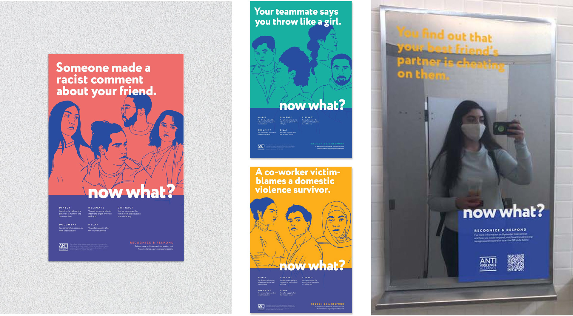
Now that we understood exactly what we needed to communicate, our team conducted iterations of visual identities. The goal was to find a way to include an example scenario, share example methods of responses, and to provide access to resources.
The AVA really connected with the concept of asking, "now what?" to their audience in an effort to motivate them to consider to how they would respond. They were also drawn to the style of hand-drawn illustrations and the options for representation that method offered.

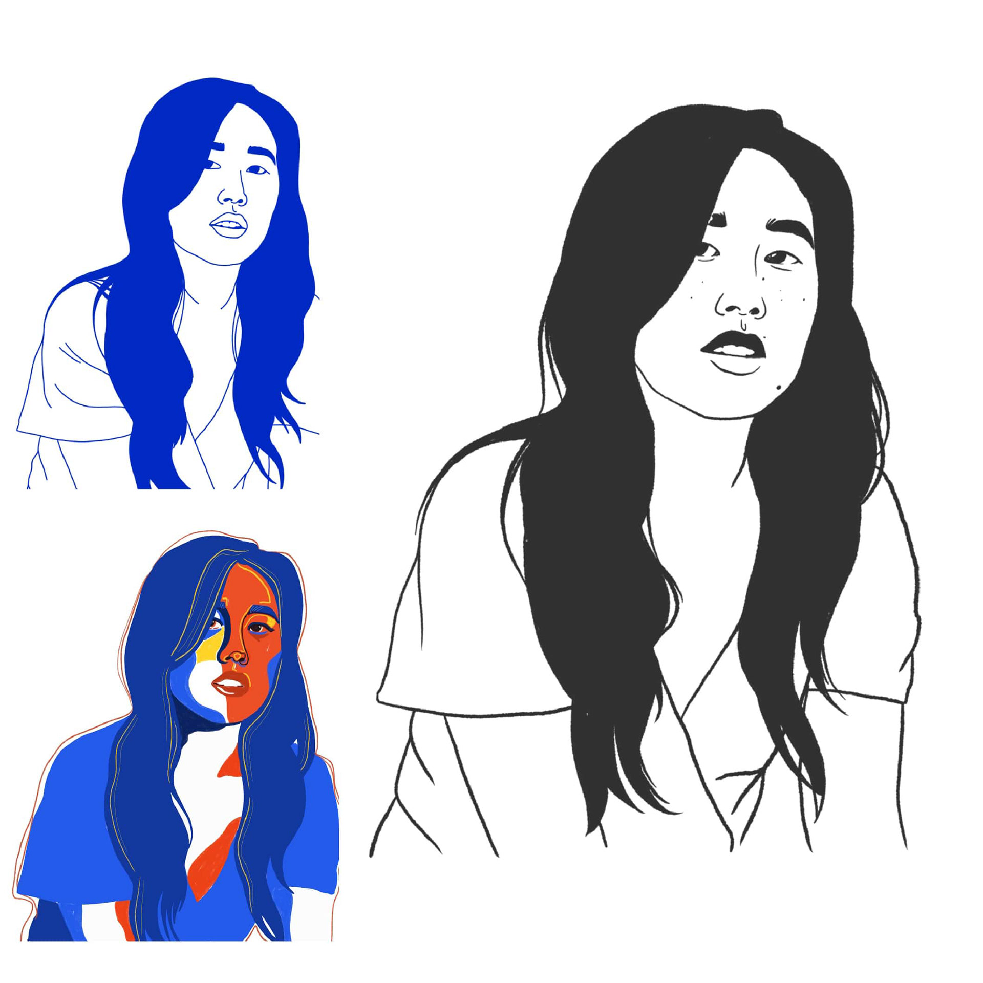
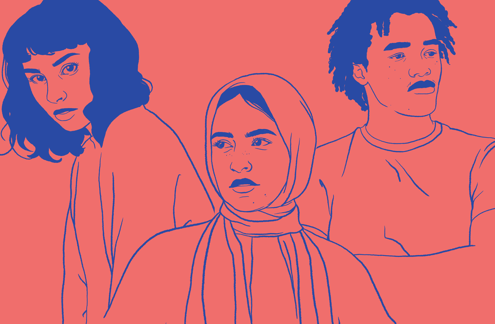
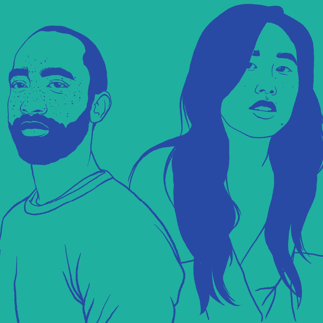
Illustrations
I assumed the role of illustrator on our team. I created the illustrations based on photo references from stock websites. I used Procreate on my iPad to illustrate and refined the style until our team and client were satisfied.
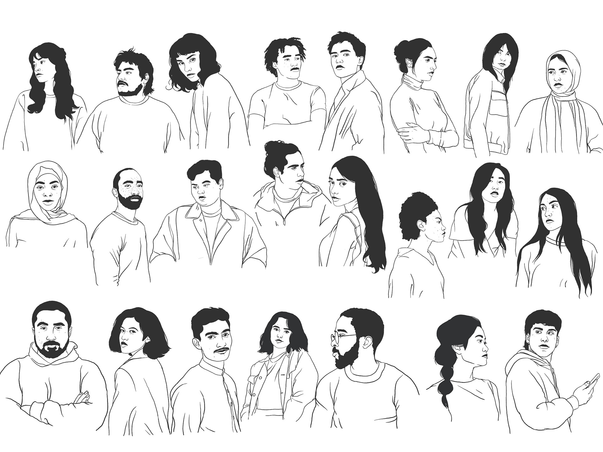
Illustration Library
Diversity and representation were very important to this campaign. To ensure we were as inclusive as possible, I decided to create a library of many different people that we could use for campaign touchpoints.
Campaign Pieces
With the illustrations refined, we were able to move on to campaign items. We designed more posters, social media graphics, stickers, buttons, mirror clings, magnets, and an interactive display for tabling events.

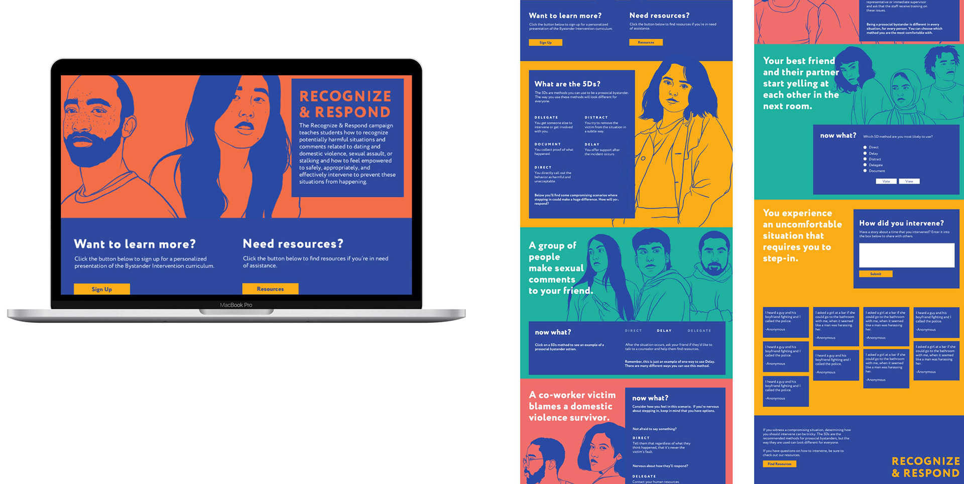
Webpage
In all of these campaign items we directed users to a webpage where they could learn about bystander intervention, the methods to use in certain situations, and to create a place to provide additional resources. I designed and developed this webpage to include interactivity so that the users could get directly involved and consider how they would respond to situations.